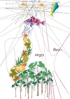
In my third CAD session I learnt how to scale, use proportion and filters, and I used the type tool.
 |
| Just like my last session I began with a basic outline. I did this with Illustrator and drew around it with the pen tool. |
 |
| I began to add symbols and created patterns using the proportions. I really like the fire in her eyes and the trees. |
 |
| This is showing how I used filters to distort/mangle her head and shoulder. I thought her head look really cool and funky. |
 |
| I began adding text. I realise it doesn't say anything in English but I liked the lettering. I also made the letters multi coloured like her head but you can't really see it. |
 |
| I then changed the way the writing was typed. I changed it to a spiral and wrote what I could see on the picture. |
 |
| I took off the spiral and just wrote my name in the cool lettering from earlier. |
I found using most of the effects pretty straight forward and I'm getting used to using all the different tools.
What do you think?
XOXO
No comments:
Post a Comment