January 21, 2013

The start of something wonderful.

In college we have been given Two new briefs. In these briefs I will write my own brief and work to this to create and develop a collection, that fits to a target audience and market level, a chosen trend and works into my research threads.

To begin with I Did a mind map, this showed idea's, trends, seasons, era's and cultures, fabrics, colour themes and other research idea's that I wanted to look at.

This is my mood board, showing all my original idea's. 

The two main concepts I chose to research into were 'Hippies' and the '50's.' 

What do you think? 
How do you begin when designing or thinking of idea's? 

XOXO

January 09, 2013

Fashion in Illustration.

As I mentioned in an earlier blog, I had to create four illustration boards to portray Noir and illustrate my designs.

These are my first two these were done in the Style or Rene Gruau. I did an blog about him earlier. I also showed you my recreation on his work.


I was really happy with both my outcomes but this one was a little hit and miss whether I thought it would work as it isn't very sex and tailored like Noir, but I like the final image. I illustrated my parka coat on this board and tried to make the model look natural but feminine and sleek.


This board in my opinion is very sleek, sexy and fits with Noir's look although her face and hair are very 'posh' and not very natural and doesn't look like a typical Noir model. In this illustration I illustrated my bandeau top with a trim. I was really happy with both boards and think they came out well in the end.
Although they both took forever because I kept redoing bits and panicking about how it will look.

-----------------------------------------

The next two images are my final two boards and for these I used the techniques of Manolo Blahnik. While experimenting with his work and techniques I realised I have really taken to his style and I think I will use this more in the future especially now I have added my twist to it and made it my own. 


These two boards are my ultimate favourites, I don't think I have ever been so proud of something in my life! HA! 
I love the use of Blahnik's techniques and I put these into practise by enlarging the foot of my mannequin, the top of my mannequin and also the details of the garments like my peplum top. I used white lines and blocks of white to show shadow and 3D effect. Although I did make a little smudge but I hid it with white paint.
Can you tell?


My final board was a little hit and miss on whether I was going to like it but after I'd finished and added some light lines on the bottom of the dress I preferred the outcome. I think I can honestly say I tried my best on these boards.

What do you think?

Do you like doing illustrations?

XOXO


January 08, 2013

Getting to grips with the concept of things.

CONCEPT BOARD...

So for my brief at college I have to create and explain my concept and to do this I made a board. 

My concept includes 'The Tales of the Orient', 'Military' and 'Countryside Alliance' trends. 


I created this by finding images of my three trends and the top left corner is Noir which is the brand I am designing and creating a concept board for.
I then painted the cherry blossom over the top of the images and the whole top right of the board although it did get a little fat in the middle which annoys me.

When talking to my tutor we came to conclusion that I should have arranged it differently to put the main focus on what's important and the images that will portray the concept better. I could have added a border and had the important or main images over lapping the border so that the interest is on those as they are in the eye line.
I should have maybe thought out going around the figures on photoshop like I did on the image in the bottom left corner so as to put the focus onto the clothing and the models. 

I like my board but it could have been a lot stronger if I had put more thought into it! If I were to do this again I may even change the paper from landscape to portrait to have less white spaces and even add more images.

What do you think?

Do you create concept boards?

XOXO

Rene Gruau.

For my brief at college I was researching into illustrators and fashion illustrations.
One of my favourites so far is Rene Gruau, 1909, Italian born fashion illustrator. 


I created this using Photoshop. 2012.

On a recent blog I showed you how I recreated one his pieces, the image I created is on the bottom left corner of the above image and is one of my favourites of Rene's.
I really like the effect he has with paint, before recreating and looking into Rene's work I hated using paint and was never very good at it but I have come to enjoy it and like the outcome. Although I prefer doing block colours and not blending etc.
His paintings are all very feminine and pretty. Many of his paintings are women and a lot of them as you can see use red.

When creating my illustration boards for college I used Rene's technique and style as I thought it fitted with my theme of Noir as it is feminine but sleek and sexy. Especially the bottom left corner - the one I recreated.

What do you think of his work?

Do you have any favourite illustrators?

XOXO


December 20, 2012

Copy cat...

For college I have been doing an Illustration brief, for this I have been researching illustrators, recreating their work and using it in my own work to create illustration boards.

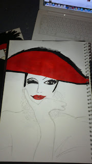
I was really proud of this recreation...

Rene Gruau...


This is the Rene Gruau image that I plan to recreate and use in my own work.


This is my sample page, I actually didn't use this eye/mouth, they were too big!


The sample page and actual illustration that I have on a card!!


Here is my recreation sketch, you would not believe how many times it took me to do those eyes! Especially the closed eye on the left! Ha.


This was the face before I revamped it.


The sketch and actual image. I think my recreation has a fatter face and isn't as feminine. 


This is a close up of the face, I really like this image, I am very proud of this outcome as I never usually believe in my drawing. 


This is where I started to add the black paint. I think the eyes went well and look effective. I was very fond of these. 


I added the gorgeous red lips.


The red hat and hair was added next. I love using nice paints, they feel so smooth to paint with! I usually hate paint but this illustration has changed me!


Although you can't tell very well I have added black onto the lips for extra definition, shape and style.


I began to add more black features as you can see. Once again the large area's are such a relaxing section to paint, it feels so relaxing and calming.


The rest of the hat was then added and the mixing section of the glove, that I nearly forgot! Ha.


Nearing the end, I painted the jewellery, which I dreaded the most but I don't think my final outcome is too horrendous! 


The red, feathery dress bit on the bottom of the illustration didn't take long and it was suppose to look textured and a little messy. 


Then finally I added some lighter tones to the dress/feathers for added affect and I'm done!

I was actually really happy with the final out come and was really proud of what I achieved baring in mind I am my own worst critic. 

What do you think?

Who's your favourite Illustrator? I think Rene is one of my top 5!!!

XOXO

December 14, 2012

Capsules.


In college I was working on Sustainability. 
Looking into designers, fabrics and trends.
In the end I had to design a capsule collection.

Here are my original designs...


Most of the inspiration for this garment came from the trend 'Tales of the Orient.'
I really am a little obsessed with Frog-Fasteners. 


The lapel on the long dress is taken from older Noir collections and tailoring as it is a large part of Noir.


I dislike the coat design here, I feel it is over powered and I don't believe it fits in with the Noir look.


This is my favourite design; the parka styled coat. 
I just love the shape and style of Parka's.
Again, I added frog-fasteners to the front!


I used this in one of my final outfits as I think the shape works well and the fit is very Noir but with a Jessica edge. At the front it is short and like a peplum, but at the back it is elongated and rounded, I made it off balance to fit in with my design principals.


I used the longer trousers in my collection and took the inspiration from the 'Countryside Alliance trend.'


All my inspiration was taken from Noir's style, and my trends; Military, Tales of the Orient, Countryside Alliance and Black Leather, although the leather didn't come into the designs often as I am doing a sustainable brief and Leather isn't sustainable and I didn't like the details and aspects as the other three, as Countryside Alliance is my favourite.

What do you think?

XOXO

NOIR


Noir is a very sleek, sexy, feminine label.
They use tailored shapes and sexual inspiration.
They use 100% organic cotton. This is sourced by the Illuminati 2, in Uganda.
The label is ready-to-wear/high end high street. 
All of Noir's collections are designed with the three things in mind; Femininity, Quality and Distinctive design. 
Noir's signature colour os obviously black, but they do add subtle tones of cream and other colours.

I really like the Noir style of work. The tailoring and fit of the garments is exceptional.
I like the cut of the clothes and the styling of some of the images.

Here's a few images to give you a clear view of what I've said...


I love their logo, it's so clever (If you look at it upside down it would still say the same thing.), I like the contrast of gold on black and how feminine it looks, it portrays Noir very well.

What do you think?

Do you like Noir?

XOXO
  

Got to be on trend.

For my sustainability brief I had been looking into current and upcoming trends. 
I found many trends that I thought were inspiring and had big bold pieces, but I found 'Black Leather', 'The Tales of the Orient', 'Military' and 'Countryside Alliance'.

There were my favourites...

Countryside Alliance

Military

I created these pictures on Photoshop.

What do you think?

What's your favourite upcoming trend?

XOXO

Annie O.

At college I am looking at sustainability and to carry out this research I looked into sustainable designers, I looked into Annie O as one of my designers, she is my may fave of all the designers I researched!


Annie works directly with Artisan's. Artisan's are people that make items that are either strictly decorative or functional. This helps them with healthcare, education, water and energy. She works closely with women who have been the victims of domestic violence to create shawls, clutch bags, other one-of-a-kind pieces and belts.
For Annie O's collections she uses inspiration from the traditional techniques of the artisan communities. A lot of her collections are decorated birds, flowers and dots. Vibrant shades are used and all pieces are made within small family businesses in the Slums of Lima, Peru.


I really love Annie O's work, it'a bright, colourful. vibrant and bold. The work she does is inspiring and very caring. She and her workers create beautiful pieces, that all look like a work of art.

What do you think?

Do you support sustainability?

XOXO

November 16, 2012